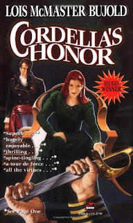
 So far all my comment about book covers have been positive. I think it is time for a change, so for this article I’m going to talk about two covers I hate. The first is one for a book I have yet to read; Lois McMaster Bujold’s Cordelia’s Honor.
Just look at those garish colours! And what you can’t see from that picture is how shiny the cover is. It all gives a terrible impression of cheapness. Of a tacky book. Plus it makes me really hope that the blade in the foreground is blunt, either that or the holder has extremely tough hands.
But not only is the picture itself off-putting, but the cover is covered with attempts to gain any and all attention. The combination of announcing that the novel is a Hugo winner coupled with the selection of praise hints at desperation to me. One would have been more than enough, preferably the Hugo announcement. Those strategically edited extracts from reviews always remind me of the fact that they could be taken out of context. Even if they weren’t I don’t need all that “Pick me! Pick me”.
I can’t be too critical however, I still bought the book didn’t I? Yes, that was because I’ve read other novels by the same author and enjoyed them, but also because it was fairly cheap. So here is hoping that Baen, the publisher, saved a heap of money on cobbling together this hideous cover.
The other cover that I’m going to complain about is that of Sherri S. Tepper’s Grass:
 There is nothing quite as horrific about this one. It simply doesn’t appeal in any way to me. However, the large font indentifying the author more than does it job, so any Tepper fans can easily ignore the picture. I like the general idea of the cover. Big blue skies and the hero in the coloured grass that gave the book its name, and the strange planet that much of this sci-fi story is set on. But the figure in the centre just doesn’t work for me. She seems far too young to be the character of Marjorie, but I can’t really think who else she might be. And then there is the outfit she is wearing. Parts of it I understand, but it just looks wrong.
Science fiction and fantasy novels are often guilty of poor design. Maybe because they aren’t really treated as “proper” books, or maybe because the publishers think that readers like these weird images. Scantily clad damsels in distress are often a feature, these two covers don’t fall into that cliche, but that doesn’t make them any more visually appealing.
From my point of view a cover should draw the reader in. Make them wonder what the story will be about. It should delight the eye, not make you wince as the cover to Cordelia’s Honor does. It should not be instantly forgetable as Grass’s cover is.

No comments:
Post a Comment