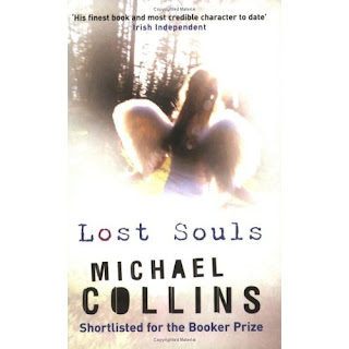
 It is Halloween season, and so I’m reading along with a spooky themed challenge, Carl’s Reading Imbibing Peril, or RIP for short, Challenge. And one of the books I chose to read was Michael Collin’s Lost Souls. It is blurbed (yes, I verb random nouns) as a suspense or mystery novel so it fits with that part of the challenge. Plus, it takes place at Halloween so I thought it’d be perfect. And it turns out that cover is one I want to talk about, so it lets me kill two birds with one stone.
The cover of the book shows the victim of the hit and run that begins the story: a 3 year old girl, dressed up as an angel for Halloween. There are lens flares that obscure parts of the photograph, and it looks overexposed, too much washed out white over which the title, the author’s name is plastered across the front, plus the information that this has been shortlisted for the Booker; one can’t forget that sort of PR.
It is, in my opinion, the perfect picture for this novel. It fits the theme well--that fleeting innocence of childhood. And of course the fact that we can’t see the child clearly, well if I said that it echoes the fact that we often can’t see that innocence because as we grow older we tend to become slightly cynical would I be stating the obvious? Then there is the fact that she is dressed as an angel which may remind the prospective reader of hope, or redemption, another central theme of the novel.
So this is a clear example of a cover design that works so much better after you’ve read the book. Before, when you may be just browsing the shelves in a store, it is simply a pretty picture and doesn’t have any such resonance. And strangely enough that fits in with the story as well. After all doesn’t every suspense story involve trying to make the reader look a little harder at what is right in front of them?

No comments:
Post a Comment